Page Financials
Revitalizing the user experience for Africa's premier loan grant platform, boosting user retention by 30% and skyrocketing total brand revenue.
Overview
Page International Financial Services Limited is an innovative retail finance institution duly licensed by the Central Bank of Nigeria, operating within the nation of Nigeria. Page Financials offers swift and efficient loan services, investments, and a range of other financial solutions through diverse channels, including internet and mobile app platforms.
Since its inception in 2014, Page Financial has served a vast clientele exceeding 50,000 Nigerians hailing from both the public and private sectors. Its commitment to delivering exceptional financial services has remained unwavering, driving economic growth and empowering individuals and businesses across the nation.
The challenge
Page Financial's mobile app has experienced lower engagement than expected, despite achieving over 100,000 downloads on the Google Play Store. The app has received numerous negative reviews, resulting in an alarming rating of 2.7.
Clearly, users have encountered difficulties while using the application, necessitating a redesign. The primary focus of the redesign is to streamline the registration process, enhance the accessibility of loans, and improve the overall interface of the app. The screenshots below illustrate some of the negative reviews from frustrated and dissatisfied users:
.png)
My role
As a product designer, I joined a team with a mobile app developer, and a backend developer to redesign the app's interface and user experience. After 12 weeks of hard work, we created a user-friendly, visually appealing app that addressed previous issues. Excited to launch and make a positive impact on our users' lives!
Understanding the problem
To commence the project, I initiated an in-depth research process aimed at comprehending the challenges encountered by users. The primary objective of this research was to gather substantial insights to address the following questions:
Who exactly are the target users?
What are the challenges these users face when using the app?
What are those processes the users find complex and rigid?
How can we the align the users needs with the company’s goal and objectives?
What model do I need to take into consideration while solving the problem?
Quantitative Interviews
I employed a Google survey form to gather valuable insights regarding user experiences and the issues they encountered. Regrettably, I am unable to disclose detailed research results due to their highly confidential nature. However, I can provide a concise summary of the interview outcomes:
1. User Pain Points: Through the survey, we identified specific pain points that users encountered while interacting with the mobile application.
2. Registration Process: Users expressed difficulties and confusion during the registration process, indicating a need for improvement in this area.
3. Loan Accessibility: Many users reported challenges in accessing loans quickly, highlighting the significance of streamlining this aspect of the app.
4. Interface Usability: Feedback indicated that the current app interface was not intuitive and required enhancements to deliver a more user-friendly experience. Armed with these crucial insights, our team utilized them as a foundation to drive the redesign process, addressing the issues head-on to create an enhanced user experience for the application.
Qualitative Interviews
With the collaboration of stakeholders, I conducted an open talk session with three users of the app. The objective was to observe their reactions and gain insights into the potential psychological impact of the issues they encountered. Understanding their emotional responses was essential in formulating effective solutions. Here are some quotes from the interview:
User A: "The registration process was so frustrating; I almost gave up. It made me question if the app was worth using at all."
User B: "I needed urgent funds, but the loan approval took forever. I felt stressed and anxious as I had no other immediate options.
User C: "The app's interface is confusing, and I often find myself lost while navigating through it. It's a source of constant frustration."
These quotes provided valuable insights into the users' emotions and experiences with the app. Our aim is to create an app that not only resolves the practical issues but also alleviates any psychological distress users may encounter during their interactions.
User Persona
Meet Lisa Obasanjo, our user persona. Lisa is a 32-year-old marketing professional working in Lagos, Nigeria. She leads a busy and dynamic lifestyle, juggling work responsibilities with personal commitments. Lisa is tech-savvy and relies heavily on mobile applications to manage various aspects of her life.
Goals and needs:
Lisa is looking for a reliable and efficient financial app that provides quick and hassle-free access to loans when needed.
She desires a seamless registration process that allows her to get started without any confusion or delays.
Lisa seeks an intuitive and user-friendly interface that makes navigating the app effortless, saving her time and effort.
As a busy individual, she values an app that offers convenience and ease of use, allowing her to manage her finances on the go.
Pain points:
Lisa experienced frustration during the app's registration process, leading her to question the app's overall usability
The slow loan approval process caused her stress and anxiety when she urgently needed funds.
Lisa seeks an intuitive and user-friendly interface that makes navigating the app effortless, saving her time and effort.
The app's current interface confuses her, making it challenging to find the information and services she requires.
With Lisa's persona in mind, our goal is to create a redesigned mobile app that caters to her specific needs and preferences. By addressing her pain points and aligning the app's features with her goals, we aim to deliver an exceptional user experience that resonates with Lisa and users like her.
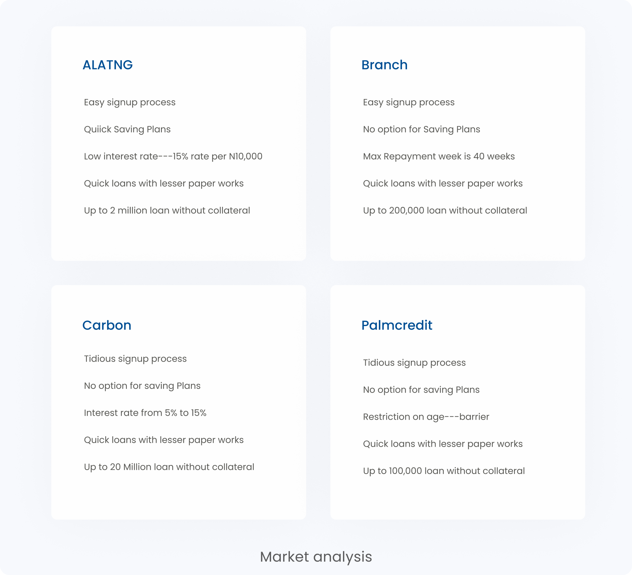
Market/Competitive Analysis
Subsequently, I embarked on an analysis of various comparable products available in the market. I thoroughly examined their processes, how they addressed their users' needs, and the outcomes they achieved.
The objective was to gain insights into existing solutions and formulate an enhanced version of the current product. Among the applications I compared were ALATNG, Branch, Carbon, and Palm Credit. This systematic study provided valuable information to inform the design process and enable the creation of a superior and user-centric mobile application.
Defining the Problem
Having identified the problems and opportunities in the market, I synthesized all my research findings using the HMW (How Might We) question pattern. This approach helps frame the insights into actionable questions that guide the design process effectively:
How might we simplify the registration process to ensure a seamless onboarding experience for users?
How might we expedite loan approval and enhance accessibility to meet urgent financial needs?
How might we redesign the app's interface to make it more intuitive and user-friendly for a smoother navigation experience?
How might we leverage the identified pain points in the market to create a more competitive and compelling product?
By framing the challenges as "How Might We" questions, we encourage a collaborative approach to finding solutions, fostering creativity and driving innovation in our redesign process. These questions will guide us in creating user-centric improvements to the mobile application, resulting in an enhanced and successful user experience.
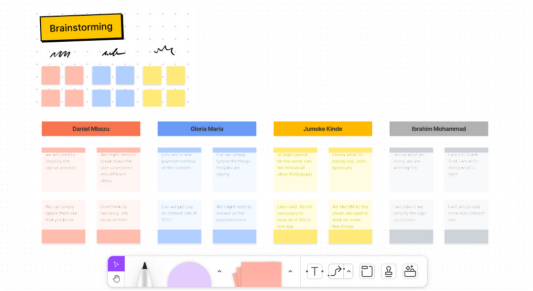
Brainstorming Solutions
With the problem statements listed, our team engaged in an extensive brainstorming session to identify the most viable solutions for the product. This collaborative process involved active participation from all stakeholders.
We utilized Figjam, a collaborative digital whiteboard platform, to facilitate our brainstorming and problem-solving sessions. During the Figjam sessions, we encouraged open discussions, free-flowing ideas, and creative thinking. Each team member contributed valuable insights and potential solutions based on their expertise. Through this collective effort, we tackled the identified problems and explored various innovative approaches to address them effectively.
The Goal
After conducting an intelligent brainstorming session, I applied the Moscow Method to prioritize the goals necessary to achieve in the project. This approach assisted me in charting the most effective solutions for the app's existing issues. The goals I outlined were as follows:
1. Must-Have Goals: These are critical and non-negotiable aspects that must be addressed to enhance the app's functionality and user experience. They include simplifying the registration process and expediting loan approval.
2. Should-Have Goals: These goals are important features that significantly improve the app's usability and performance. They involve redesigning the app's interface for intuitive navigation and enhancing the overall user-friendliness. By employing the Moscow Method, I could focus on addressing the most crucial aspects first, ensuring that the redesign process aligned with the priorities that would have the most substantial impact on the app's success.
Ideation And User Guide
I initiated the process by creating a new user flow that seamlessly incorporated the newly added features. Presenting this updated user flow to the team garnered unanimous satisfaction, as it efficiently addressed the requirements and improvements we aimed to implement.
Sketches
I immediately began sketching out ideas, engaging in numerous iterations to explore diverse solutions to the challenges presented by the previous design. These iterative sketches allowed me to delve into various possibilities, refining and honing the design until we arrived at the most effective solutions.
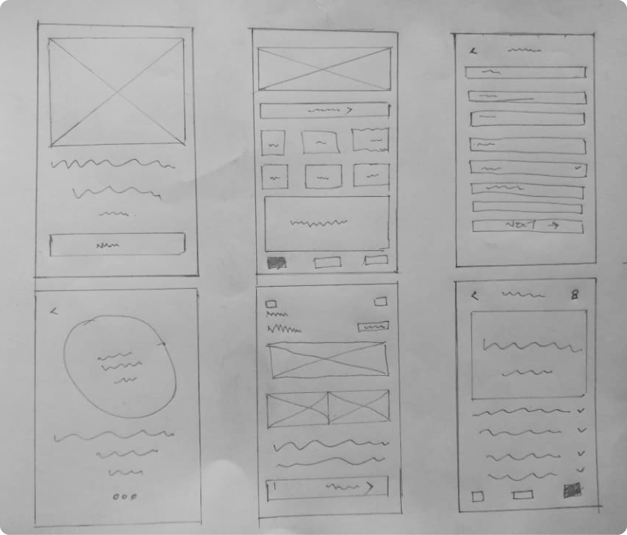
Mid-Fidelity Wireframes
After evaluating multiple sketches, we collectively agreed on the most promising one, and I proceeded to create digital wireframes in Figma. These wireframes will serve as the foundation for testing the effectiveness of the solutions we proposed. Through this process, we aim to validate our design decisions and ensure that the final product caters to our users' needs and expectations.
%201.png)
Usability Testing
With the low-fidelity wireframes in place, we conducted user testing sessions with real users. This critical step allowed us to gather valuable feedback and insights to validate the design decisions. Positive results from the user testing indicated that the design effectively met users' needs:
1. Improved Registration Process: Users praised the simplified registration flow, stating that it was straightforward and easy to follow. The clear instructions and intuitive layout helped them sign up without any confusion.
2. Streamlined Loan Access: Testers expressed satisfaction with the expedited loan approval process. They appreciated how quickly they could access funds when needed, reducing stress during urgent financial situations.
3. Enhanced User Interface: Positive feedback was received regarding the redesigned app interface. Users found the new layout more intuitive, making it easier to navigate and find desired features and information.
4. High Usability: Users reported a high level of satisfaction with the overall usability of the application. They found the interactions smooth, and the app's layout made it effortless to perform various tasks.
5. Positive User Experience: The combination of the improved registration process, faster loan accessibility, and user-friendly interface resulted in a positive overall user experience. Users expressed enthusiasm for continuing to use the app.
However, users were still not accustomed to the fingerprint feature, we took this as a mere familiarity challenge and users would get use to it with time.
Redefining The Design
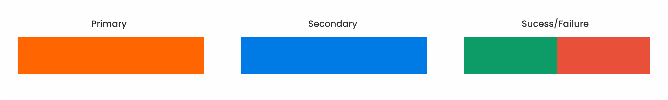
With the usability test results, we proceeded to start adding colors to our design, the brand colors are shown below
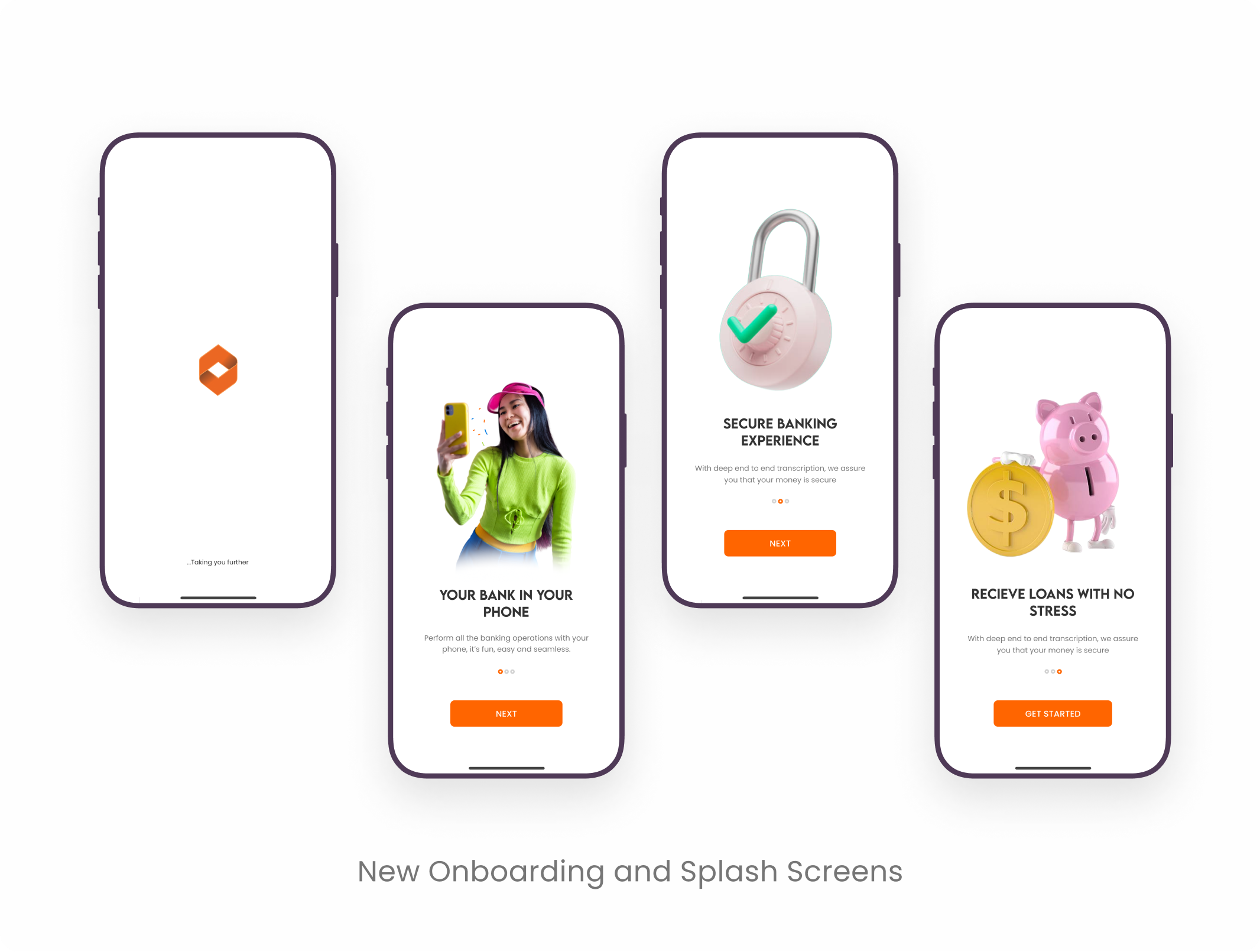
Hi-Fi Design
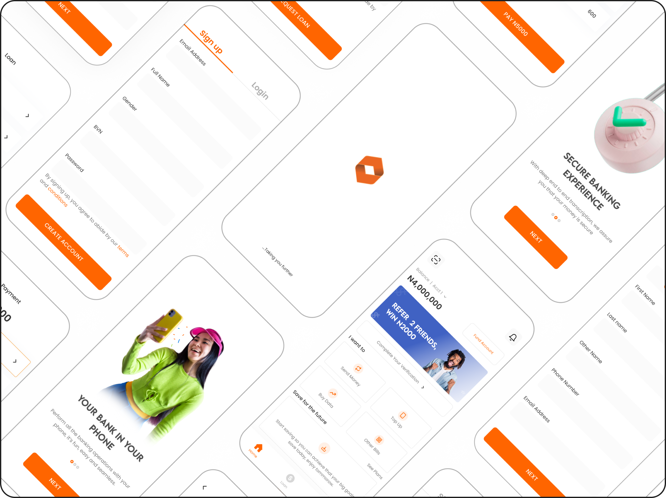
Presented below are the high-fidelity wireframes, beginning with the onboarding process. Unlike the previous design, I crafted a new and improved process that provides users with clear guidance and detailed explanations of how the app functions. The enhanced onboarding experience aims to ensure that users feel informed and confident as they embark on their journey with the application.
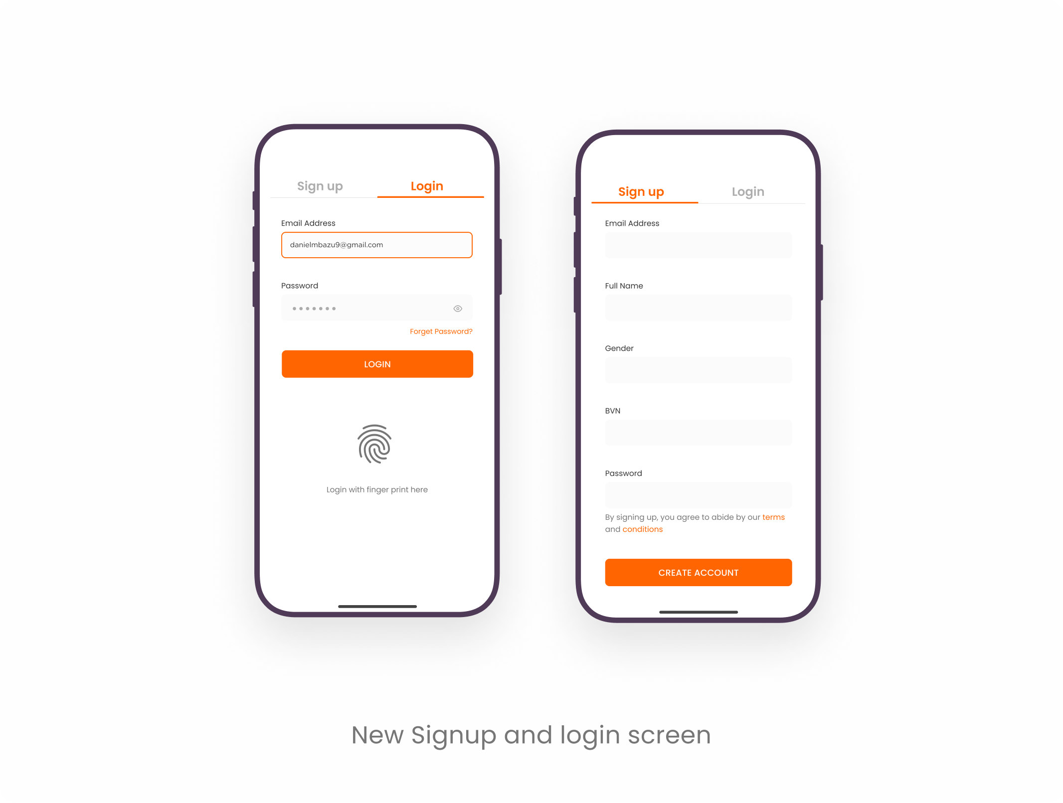
Redesigned user authentication flow
I revamped the signup process, condensing it from three screens to a single screen, making it remarkably simple for users to sign up effortlessly. By collecting only essential details during signup, we reduced friction and enhanced the user experience. Additional information is now obtained after the user completes the signup process, ensuring a smooth and swift initial entry into the app.
To further streamline the login experience, I introduced a fingerprint login button, providing users with a convenient and secure way to access their accounts. This implementation aims to increase user retention rates, as it caters to modern security preferences and aligns with users' ease of use expectations. The combination of these improvements creates a more user-friendly and efficient app, enhancing overall user satisfaction and engagement.
New Visually Appealing Home Page
The newly designed home screen incorporates exciting new features. Users can now make payments directly without the need for navigation, providing a quicker and more streamlined payment process. Additionally, I introduced a prominent banner to effectively market the company's new features, ensuring users stay informed and engaged. To further enhance user convenience, I implemented a funding button that enables users to add funds to their accounts while on the go.
This addition simplifies the process, empowering users to manage their finances seamlessly. Moreover, I optimized the transaction history view, enabling users to access their past transactions with just a simple scroll.
.png)
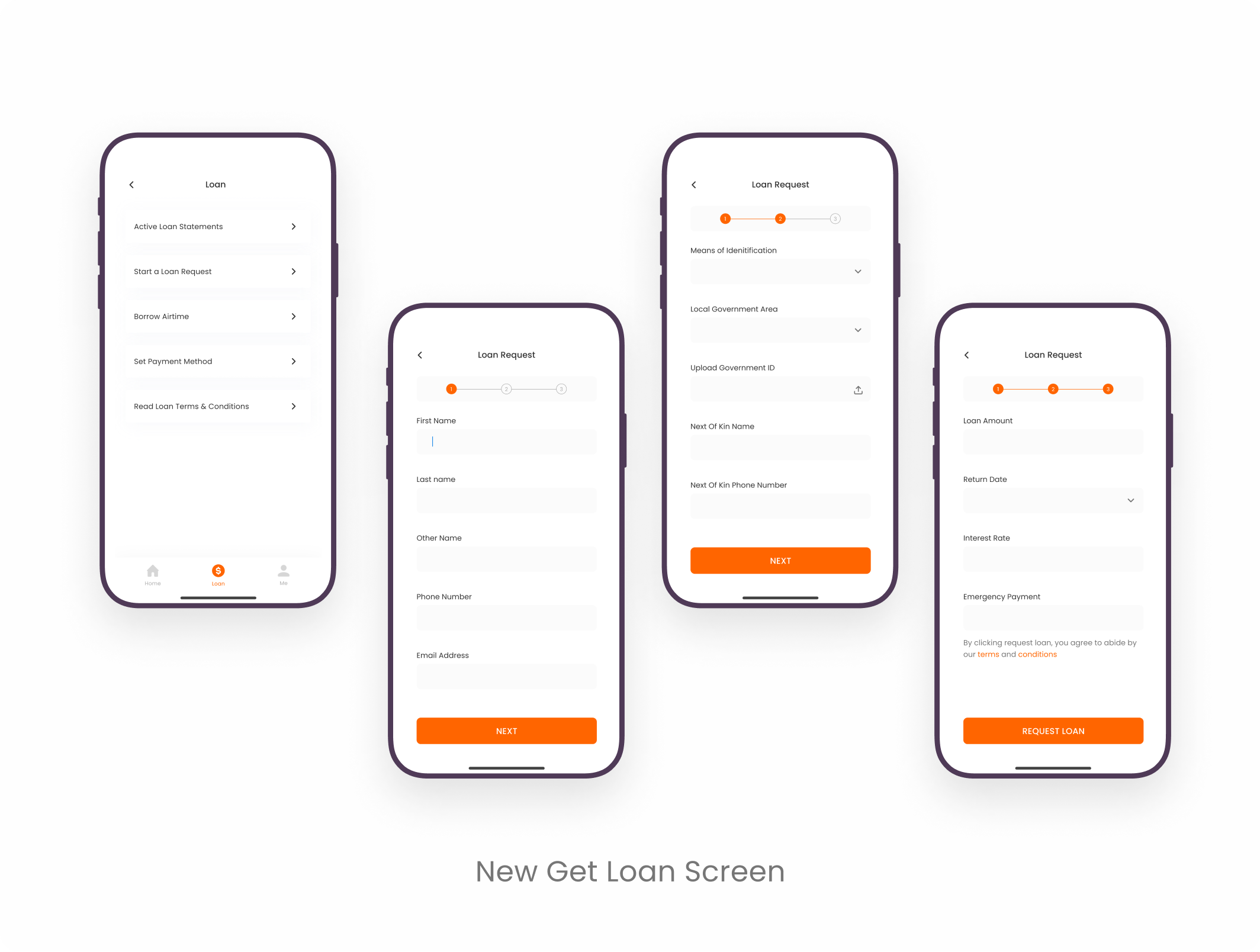
New Way To Obtain Loan
I simplified the loan application process significantly, ensuring that all steps can now be completed within the app itself, eliminating any doubts or uncertainties for the users. By shortening the process, we aim to prevent users from getting discouraged along the way, making it more likely for them to complete the application.
To provide users with a clearer sense of their progress, I introduced a progress bar. This visual aid enables users to track their advancement through the loan application process, fostering a sense of transparency and control.
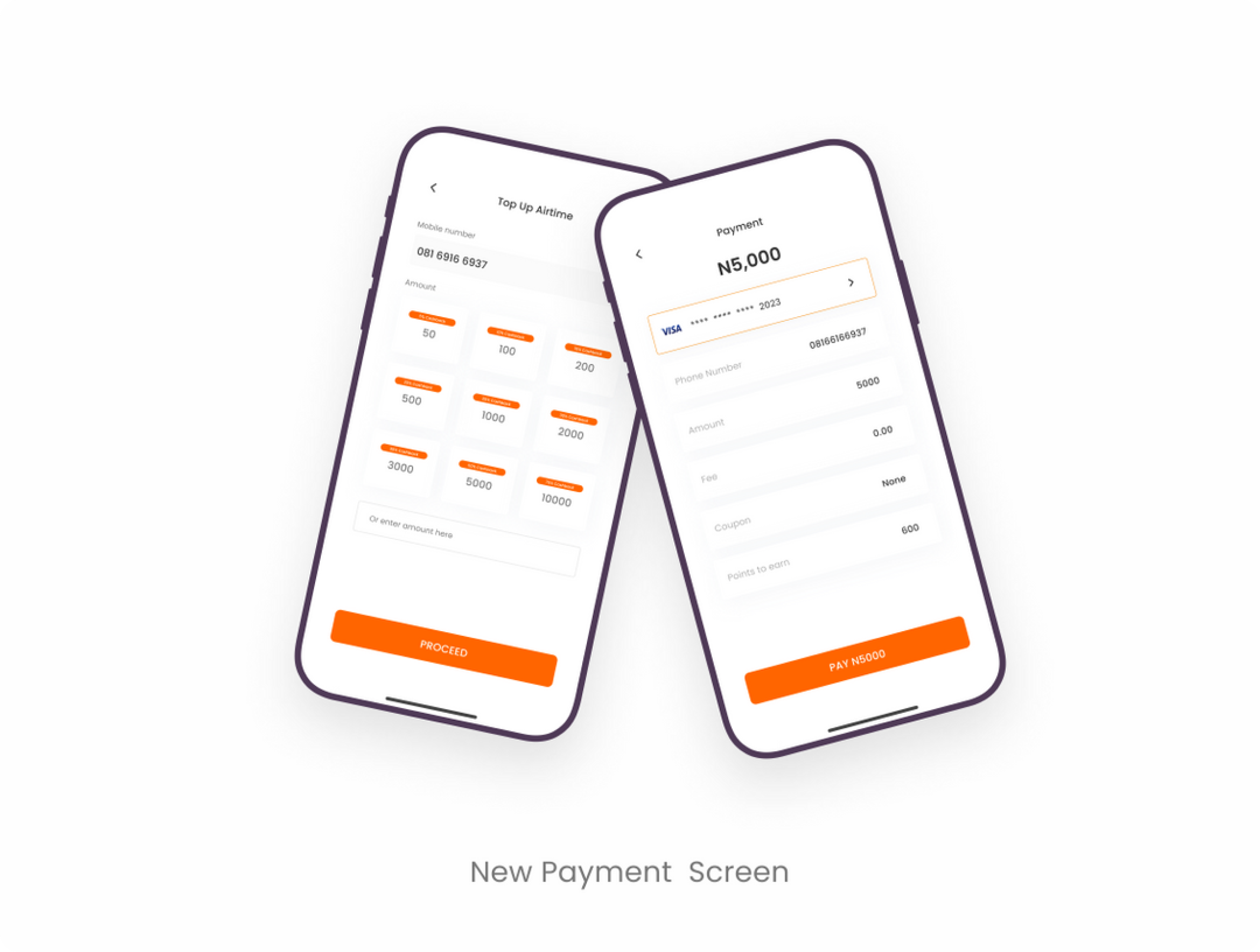
Airtime Top Up In Two Steps
I made the process of buying airtime short and seamless, users can now buy airtime in few steps, I also added a point promo code to encourage users to engage this features.
Conclusion And Lesson Learnt
One crucial lesson I learned throughout this project is the significance of inclusive design. Recognizing that individuals have diverse abilities and limitations, designing with inclusivity in mind results in solutions that benefit everyone universally. By focusing on designing for people with various disabilities, we create designs that are more accessible and accommodating for all users.
Prototype
View Figma Prototype