Fleep
Supercharging Fleeps Stock Trading Platform with AI-Powered predictions, elevating traders' confidence by 25% and amplifying user retention by 10%
Introduction
In this case study, I’ll explain how I designed Fleep, an AI integrated portfolio management app.
Background
I was contacted by AdamFard UX studio to design a portfolio management app that uses AI to predict market trends and help portfolio managers make a more confident decision for their stock trading, Given the project's pressing timeline, I was tasked with delivering a high-caliber final product within the span of 7 days, I present the approach I devised to address this task.
Understanding the problem
Before diving into the design process, I dedicated time to gain a deeper understanding of the challenges at hand, by rephrasing them in my own words, I aimed to emphasize the solutions I would be proposing. The identified problems can be categorized as follows:
1. Portfolio Management: The portfolio managers require an impeccably designed web app for data visualization, enabling efficient management and monitoring of their stocks and investments.
2. Investment Decision-making: Portfolio managers seek assistance or guidance in selecting the most suitable stocks for their investments, leveraging AI-driven insights.
3. Meeting and Communication Organization: The portfolio managers also need a streamlined process for scheduling and organizing meetings and calls related to their investment activities.
Understanding the users
With a clear problem definition, my next step was to understand the target users of the app. As I didn't have access to user research data or specific users due to project timeline, I conducted extensive online research to envision possible personas for the design.
The findings revealed that the app's potential users, who engage in stock market investments, tend to be tech-savvy individuals. They generally fall within the age range of 25 to 60 years and often belong to at least the middle-class socioeconomic bracket. While there is room for further persona development, these insights served as a valuable reference point in shaping the user experience I aimed to design for.
Market research
To bolster my design decisions, I employed Jacob's UX law, which states that users tend to prefer sites that follow familiar design patterns from other platforms. To gain insights into existing investment management apps, I extensively studied and analyzed popular platforms such as Robinhood, Acorns, Betterment, Wealthfront, and E-trade.
A recurring characteristic across these platforms is their emphasis on simplicity. Each design decision is purposefully made to be concise, straightforward, and devoid of unnecessary complexity. This approach aims to minimize confusion and create an intuitive user experience. By studying these apps, I gathered valuable inspiration and learned from established design practices in the investment management domain.
Defining the goals
With a comprehensive understanding of the market offerings, I proceeded to define the design goals, which are as follows:
1. Simplify Portfolio Visualization: Create a user-friendly and straightforward portfolio visualization interface to enable users to easily manage and monitor their investments.
2. Instill User Confidence: Build a sense of trust and confidence in users when making financial decisions by providing accurate and reliable data and insights.
3. Seamlessly Integrate AI: Ensure a smooth and seamless integration of AI capabilities within the web app, enhancing the user experience with valuable AI-driven insights.
4. Stay Updated with Finance Industry: Keep users informed and up-to-date with the latest trends and developments in the finance industry, providing real-time data and relevant information.
5. Address Visual Doubts: Address and resolve any visual doubts or uncertainties that might discourage users from engaging with the platform, ensuring clarity and transparency.
6. Implement AI Conversational Modal: Introduce an AI-driven conversational modal to facilitate user interactions, offering personalized assistance and support within the app.
These design goals will serve as the guiding principles throughout the design process, ensuring that the final product aligns with the needs and expectations of the target users.
Creating Ideas from sketches
With the defined goals in mind, I explored various ideas through sketching before transitioning to Figma for creating digital wireframes. Each iteration aimed to ensure an intuitive and user-centric portfolio investment data visualization web app experience for portfolio managers.
.png)
Establishing a grid system
To maintain consistency and facilitate seamless communication with the development team, I implemented an 8-point grid system for the web app's design. Using the T-shirt naming convention, I assigned values for spacing, ranging from extra small (XS) to extra extra large (XXL).
This systematic approach enhances collaboration between design and development, ultimately leading to a more polished and cohesive user interface.
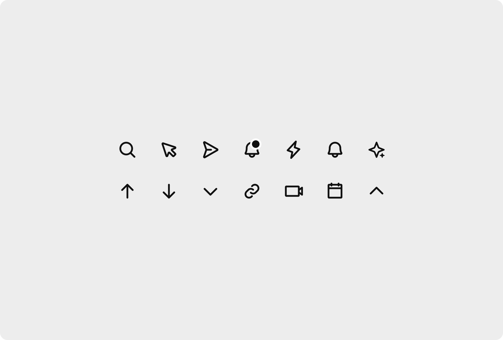
Creating an Iconographic system
Icons play a vital role in a design system, as an inconsistent icon library can lead to conveying the wrong design direction. With this in mind, I developed a 2-pixel icon system, meticulously aligned to a 20px by 20px icon grid.
Additionally, I created icons for other scales, including a 16px by 16px and 24px by 24px grid.The decision to opt for a 2-pixel icon system stems from its bold and impactful nature, aligning perfectly with the app's functions, which empower users to make financial decisions confidently and boldly. This cohesive and purposeful approach to icon design ensures a visually unified and engaging user experience within the web app
Mid-Fidelity wireframes
After exploring multiple sketches, I selected the most promising design and transformed it into wireframes using Figma.
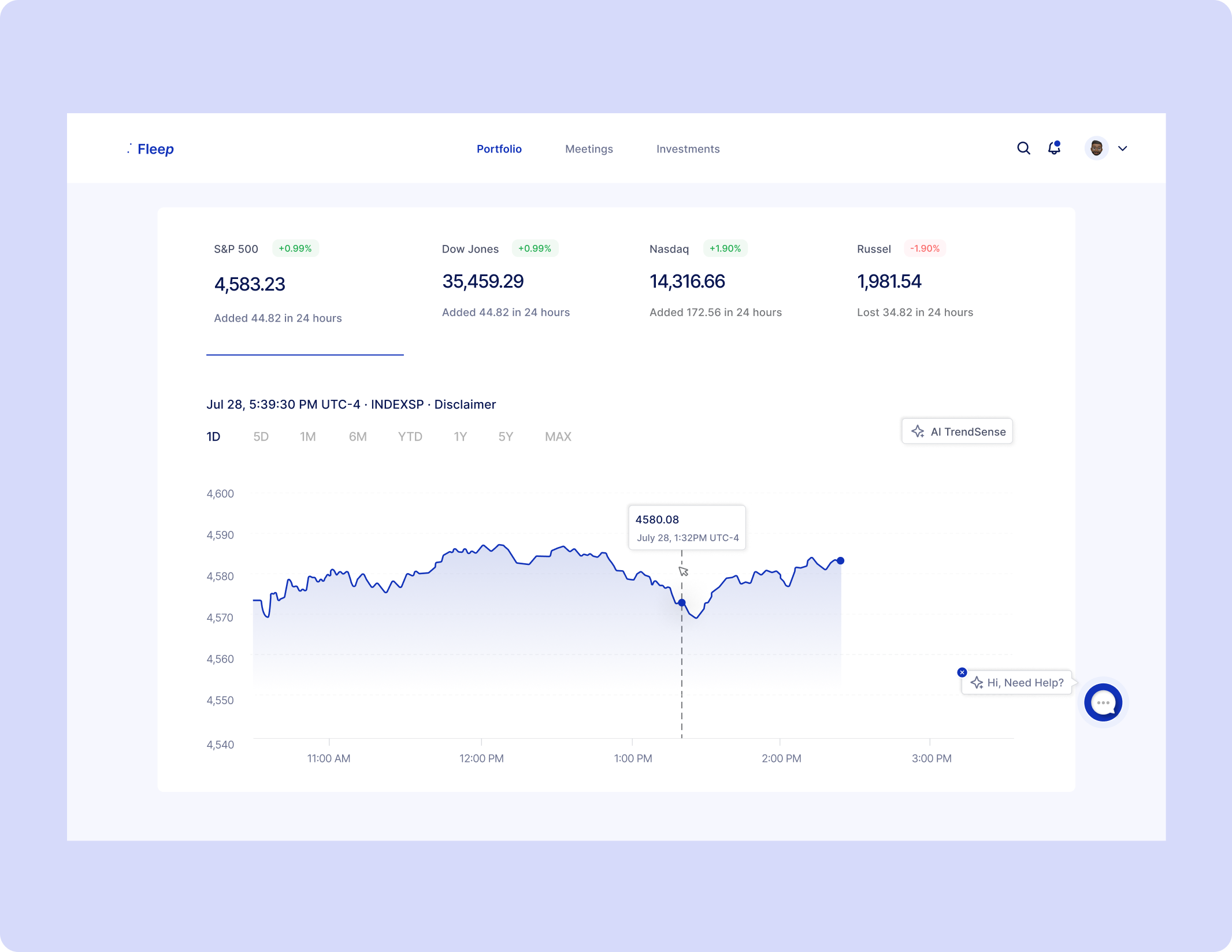
Portfolio Overview
The Portfolio screen offers portfolio managers a clear and intuitive data visualization. A line graph displays data indices of market stocks, and managers can choose their preferred periodic view. Additionally, they have the flexibility to toggle which stock they want to view on the screen.
The top four stocks showcased are either the most popular assets in the market or those saved as favorites by the managers.In the top navigation bar, managers can efficiently manage their meetings, access notifications, and easily search for stocks of their choice. This design aims to provide portfolio managers with a comprehensive and user-friendly experience for effectively managing their investments and decision-making processes.
.png)
Full Screen
The full screen extends the functionality by showcasing additional American market indexes and their performance, enabling portfolio managers to swiftly access relevant stock information and make investment decisions with ease. The streamlined design ensures that managers can view stocks with fewer clicks, expediting their decision-making process.
To keep portfolio managers informed, I integrated a news section, providing timely updates on the latest market trends and developments. This feature enhances the app's value proposition, equipping managers with up-to-date information critical for successful investment strategies.
.png)
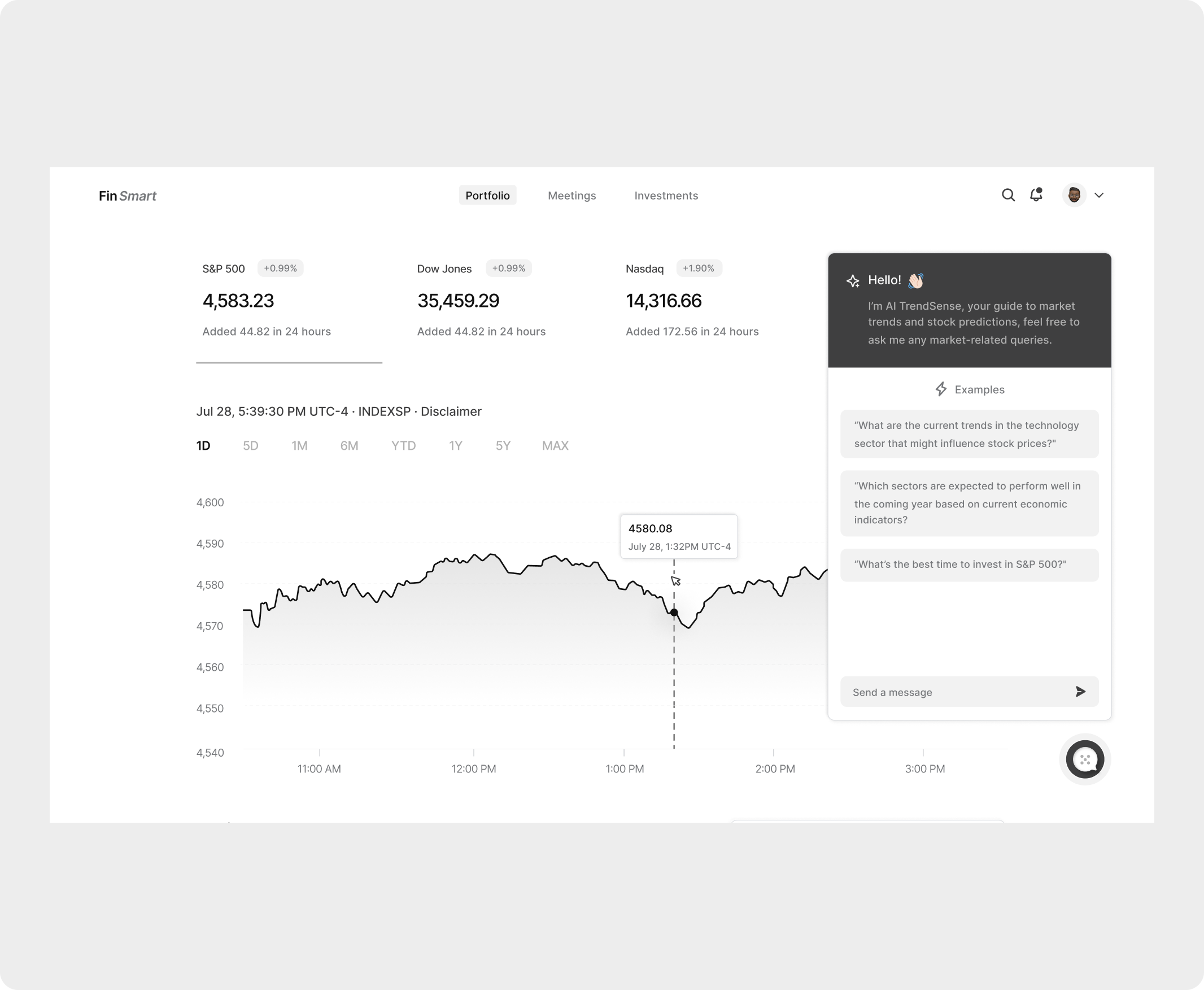
Explaining AI TrendSense
The most exciting part of the task was exploring AI options for predicting the market. After thorough research, I discovered that GPT-4 could extract predefined data and present them as visuals, which became a turning point in my design.
By clicking the AI TrendSense button, users can access the model's market trend prediction for a stock. The prediction continues from where the previous representation stopped, and users can drag it further. The fixed stop line indicator ensures users are aware of the prediction's starting point.
.png)
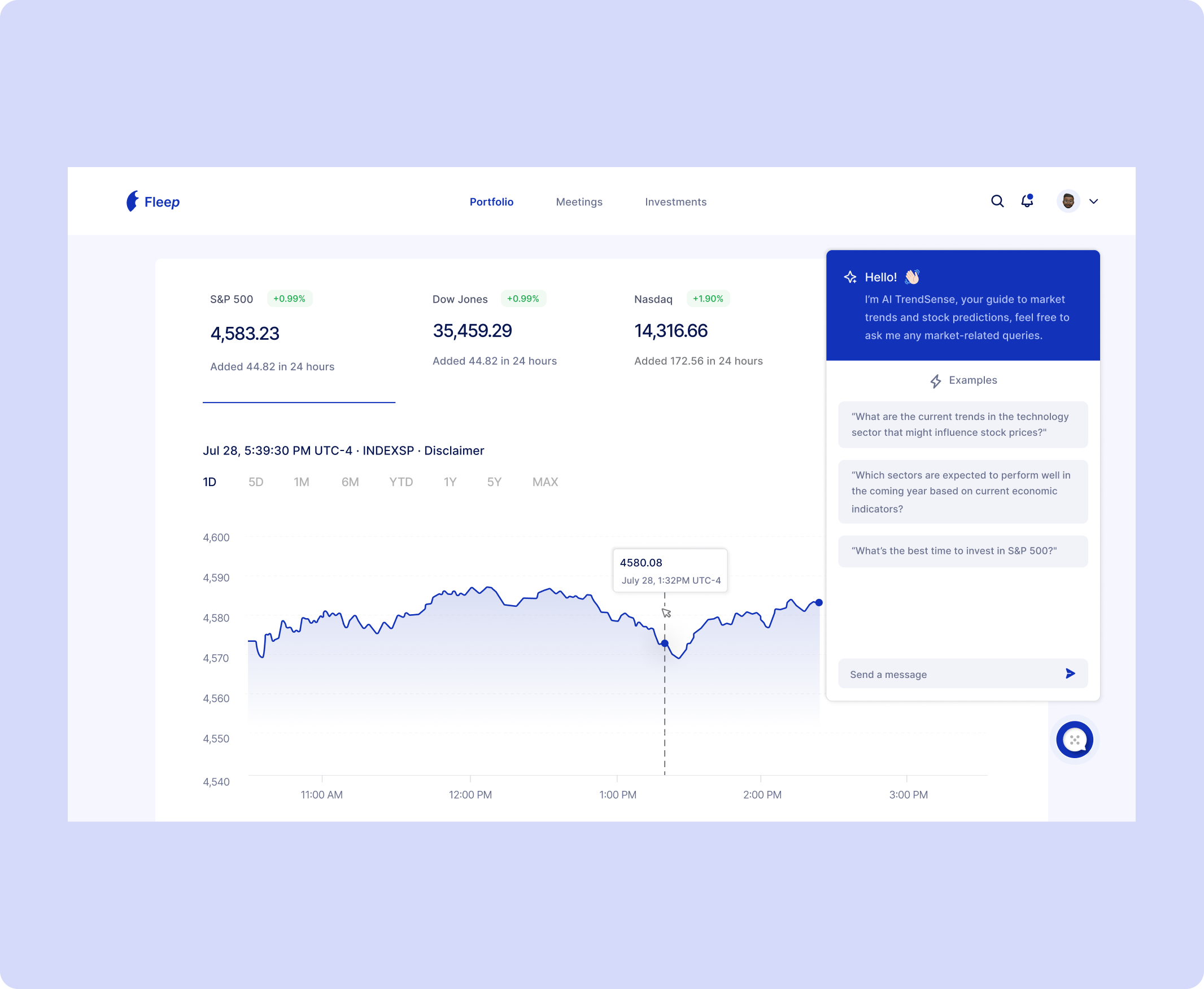
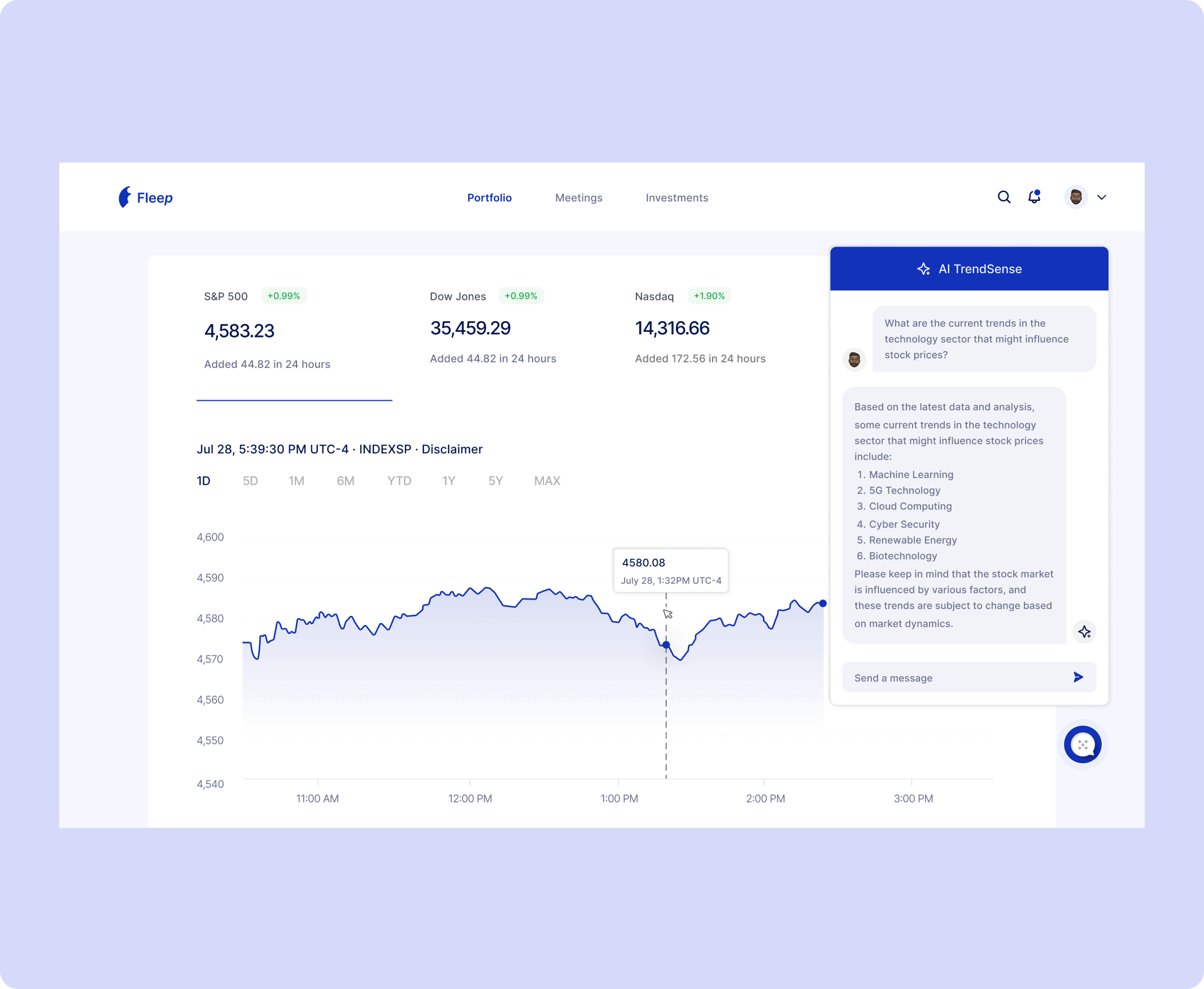
AI Trensense Chatbot
In addition to the AI prediction feature, I took it a step further by integrating an AI conversational chat bot into the web app. Leveraging the familiarity of people with chat-based AI like GPT, this integration offers users a human-like conversation experience.
Users can now ask the bot any market-related questions, and it responds with accurate and helpful answers, providing valuable insights and support. This innovative chat bot feature elevates the user experience, making the web app more engaging and informative for portfolio managers seeking real-time assistance and guidance.
.png)
.png)
Converting Designs to High Fidelity Mockups
As the mid-fidelity design started taking form, I established a color palette to define the brand's visuals and direction. While the UX remained largely consistent, the UI required a fresh touch to enhance the overall visual appeal and aesthetics. The carefully crafted color palette brought vibrancy and coherence to the design, ensuring a captivating and delightful user interface for the web app.
High-Fidelity Mockups
Having established the brand's color palette, I proceeded to create high-fidelity mockups while maintaining the same user experience as the mid-fidelity wireframes. The high-fidelity mockups offer a more polished and refined representation of the web app's design.
.png)
.png)
.png)
Prototype
I've created a quick prototype showcasing some of the app's functionalities in action. You can preview and test the prototype by clicking the link below.
View Figma Prototype